Branding Exercise 2020
VISUAL IDENTITY / STORYTELLING
WEB DESIGN / SOCIAL / EARS
VISUAL IDENTITY / STORYTELLING
WEB DESIGN / SOCIAL / EARS
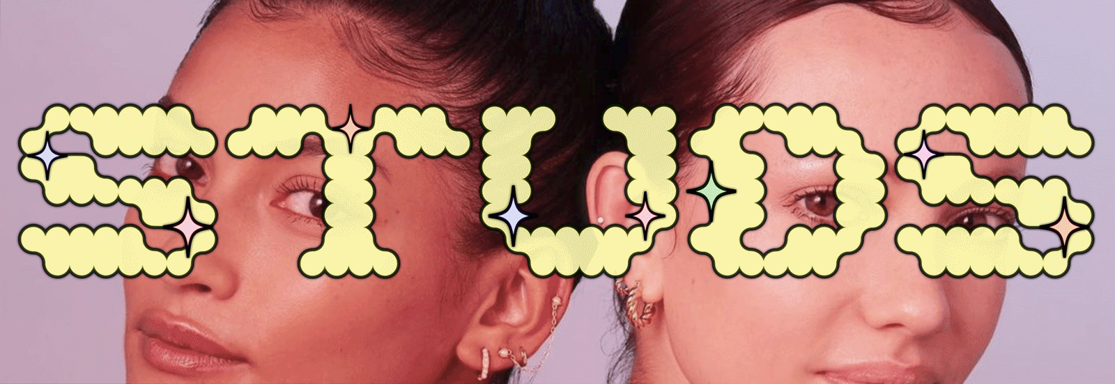
Fresh look & feel for STUDS — the step-up alternative for this generation’s let’s go to Claire’s moments.
︎Ears are the new window to our soul

︎
WITTY
EXPRESSIVE
ENERGETIC
AUTHENTIC
WITTY
EXPRESSIVE
ENERGETIC
AUTHENTIC
Studs is a jewelry brand that’s all ears, with a wide assortment of piercing services and ear jewelry to help you craft your own unique earscape.
With self-expression at the core of their brand, Studs has the opportunity to introduce a look that complements the playful energy of their products and locations.
Let’s sprinkle the spirit of their jewelry into the rest of their brand.
Let’s sprinkle the spirit of their jewelry into the rest of their brand.
A logo that exemplifies the energy and modularity of the brand—
a custom wordmark sparked to life by the shimmering and shining of its studs.
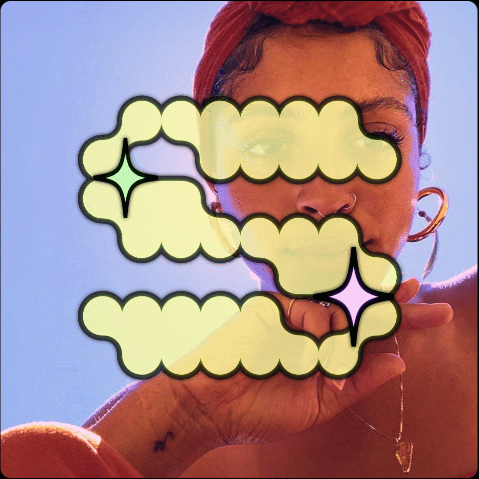
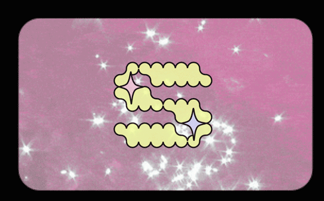
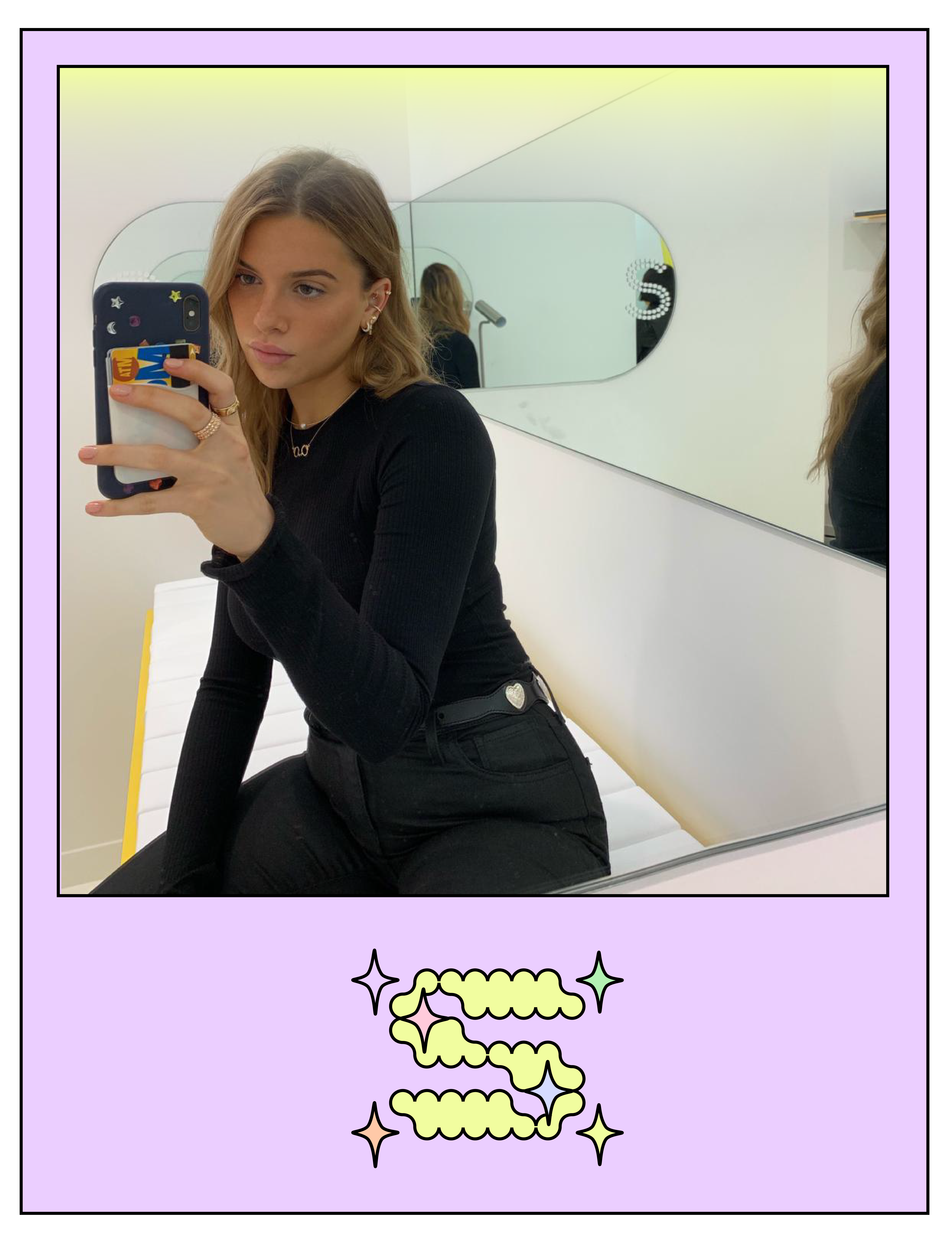
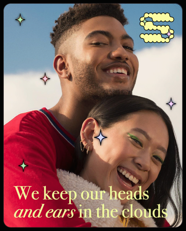
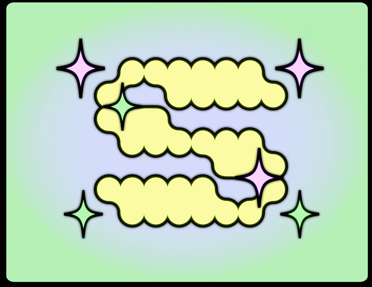 Some sparkly secondary monograms.
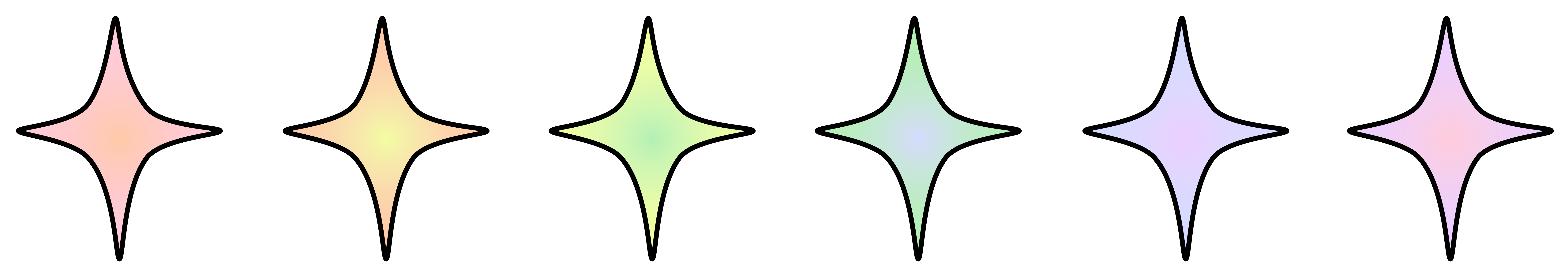
Their new look is held together by
a playful pallete of glowy gradients.
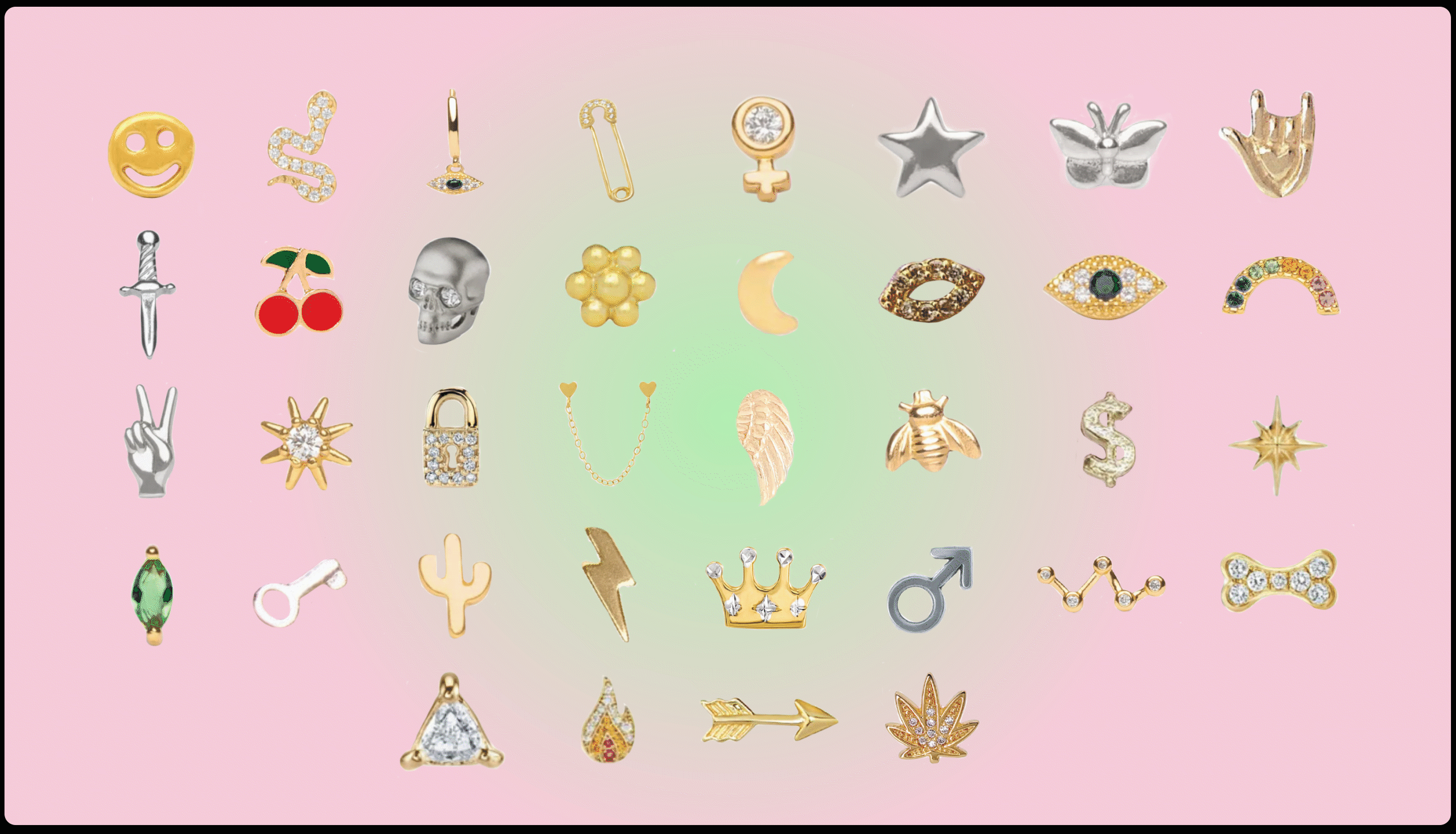
ICONS
Custom iconography resembling the collection
for a finishing touch.
Custom iconography resembling the collection
for a finishing touch.


WEBSITE
When COVID hit, Stud’s flagship stores were forced to close, making online shopping their focus.
With new brands emerging, Studs needed a website that stands out against the popular online shopping scene.
With new brands emerging, Studs needed a website that stands out against the popular online shopping scene.
HOME
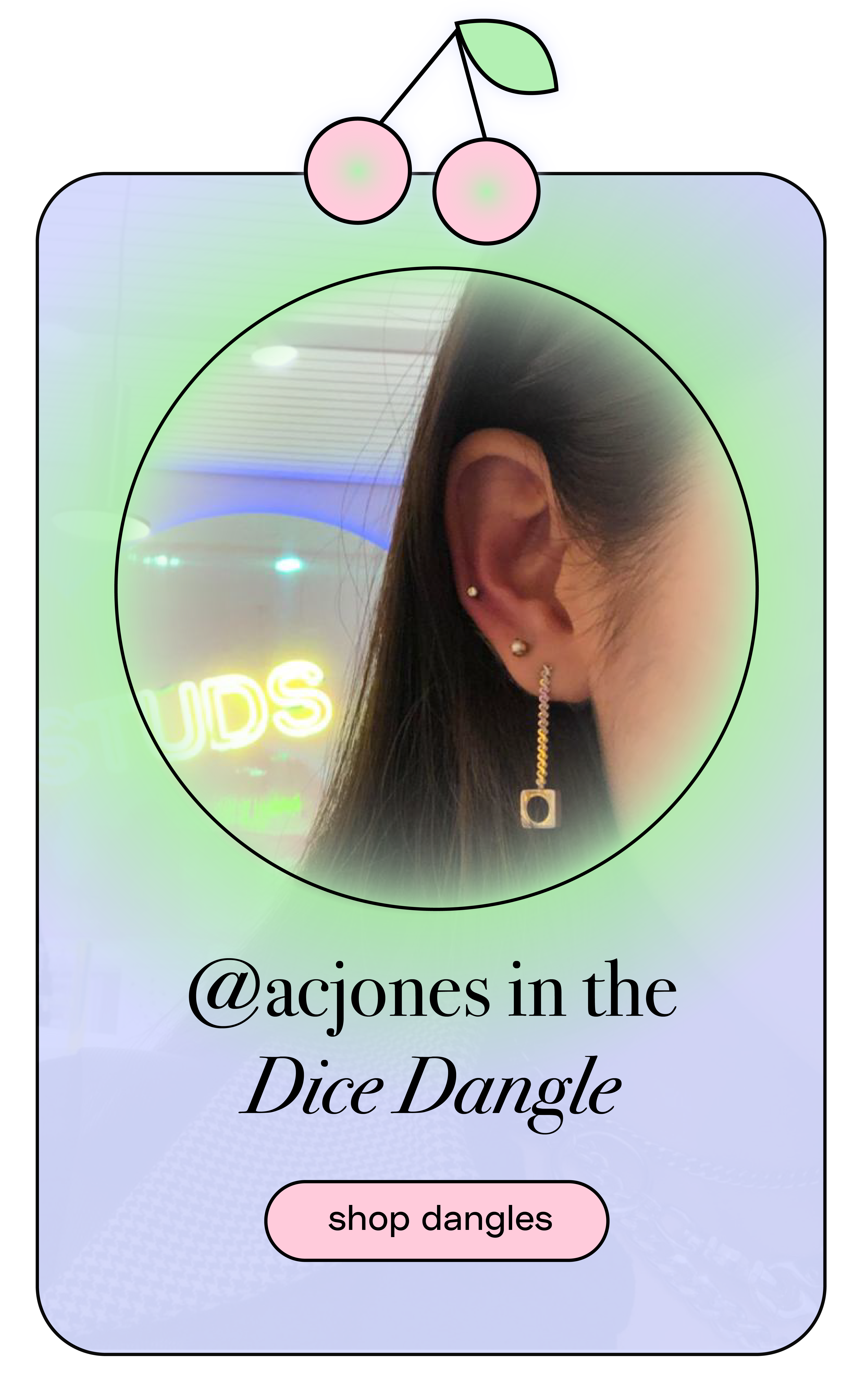
UGC-focused
catalog style
UGC-focused
catalog style

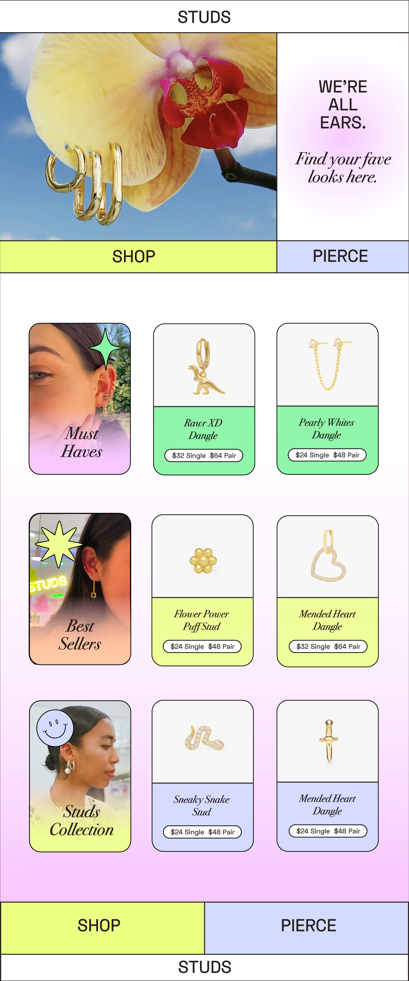
SHOP
easily navigable
swipe-familiarity
easily navigable
swipe-familiarity
PIERCE
informative
organized
informative
organized
